Hello. I am Tsuchi, a front-end engineer.
Over the past few years, the screen size of smartphones has been increasing.
Currently, 360px and 375px wide devices are the most common (as of February 2019).
Therefore, in many cases, we will want to optimize our smartphone design to 360px or 375px wide devices.
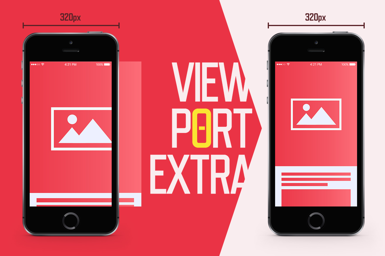
However, this often causes problems with 320px wide devices.
For example, unintended line breaks may occur in the heading, or side-by-side elements may protrude from the frame.
Increasing breakpoints to solve them is tedious because it increases the style.
There are fewer users of 320px wide devices than before, but they still exist.
We want to solve this somehow.
So I made it!
About Viewport Extra
Viewport Extra enables you to set minimum and maximum widths for viewport by rewriting the meta tag.
On screens where the display width is narrower than the minimum width, the appearance at the minimum width is scaled down while maintaining the ratio.
In other words, the width of the meta[name=”viewport”] tag is fixed to the minimum width value.
On screens where the display width is wider than maximum width, the appearance at the maximum width is scaled up while maintaining the ratio.
In other words, the width of the meta[name=”viewport”] tag is fixed to the maximum width value.
For example, if the minimum width is set to 375px, the iPhone SE (320px width device) will scale the appearance on the 375px width device down to about 85.3% and display.
It fits the screen perfectly and no extra horizontal scrolling occurs, because the initial-scale value of the meta[name=”viewport”] tag is rewritten at the same time.
Usage of Viewport Extra
It’s very easy to use.
<meta name="viewport" content="width=device-width,initial-scale=1"/>
<meta name="viewport-extra" content="min-width=375"/>
<script async src="https://cdn.jsdelivr.net/npm/viewport-extra@2.0.1/dist/iife/viewport-extra.min.js"></script>
And you’re done!
“The point is that in addition to the meta[name = “viewport”] tag, the meta[name = “viewport-extra”] tag is set. This will enable the min-width and max-width content attributes. In addition, the async attribute is set in the script tag to avoid the rendering block waiting for a response from the CDN.
See GitHub for more details.
Demo
Here is a comparison of the page optimized for a 375px device with and without Viewport Extra applied.
Reproduce 320px wide device using browser developer tool.
HTML and CSS are following (not including the script tags).
See the Pen
201902-en by ligdsktschy (@lig-dsktschy)
on CodePen.
Without Viewport Extra applied
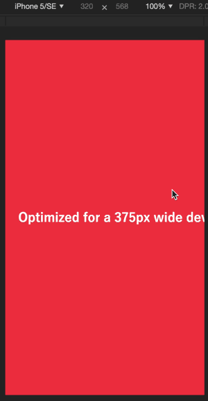
Extra horizontal scrolling is occurring.
With Viewport Extra applied
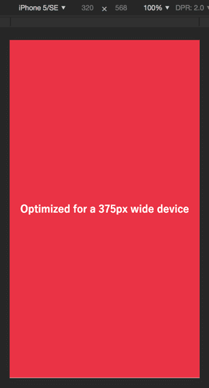
It fits the screen perfectly!
Summary
Viewport Extra will surely help you, until the share of small devices is further reduced or restored again.
Try it out! Thank you.
LIGはWebサイト制作を支援しています。ご興味のある方は事業ぺージをぜひご覧ください。