どうもです。
今回CSS3で実装されたCreative Button Styleエフェクトが素敵だったのでjQueryで再現してみました。
実装の仕方をご紹介いたします✌(´ʘ‿ʘ`)✌
目次
HTMLとCSSの準備
今回jQueryで実装するために修正をいたしました( ˘ω˘)
HTML
HTMLは参考サイトをそのまま使用します( ˘ω˘)
<button class="btn btn-1 btn-1b">Button</button>CSS
CSS3独自のtransition要素を削除して、ホバーはjsで実装するため削除をしました。( ˘ω˘)
参照元
.btn {
     border: none;
     font-family: inherit;
     font-size: inherit;
     color: inherit;
     background: none;
     cursor: pointer;
     padding: 25px 80px;
     display: inline-block;
     margin: 15px 30px;
     text-transform: uppercase;
     letter-spacing: 1px;
     font-weight: 700;
     outline: none;
     position: relative;
     -webkit-transition: all 0.3s;
     -moz-transition: all 0.3s;
     transition: all 0.3s;
}

/* Button 1 */
.btn-1 {
     border: 3px solid #fff;
     color: #fff;
}

/* Button 1a */
.btn-1a:hover,
.btn-1a:active {
     color: #0e83cd;
     background: #fff;
}
修正後
.btn {
     border: none;
     font-family: inherit;
     font-size: inherit;
     color: inherit;
     background: none;
     cursor: pointer;
     padding: 25px 80px;
     display: inline-block;
     margin: 15px 30px;
     text-align: center;
     letter-spacing: 1px;
     font-weight: 700;
     outline: none;
     position: relative;
}

/* Button 1 */
.btn-1 {
  border: 3px solid #fff;
  color: #fff;
  width: 240px;
  height: 75px;
  background: #0e83cd;
}
.btn-1:hover {
  color: #0e83cd;
}
これでHTMLとcssの準備は完了です。
マウスオーバーの実装
jQueryでマウスオーバー処理を行うときはhoverメソッド、アニメーションの実装はanimateメソッドを使用するのですがそれぞれ注意点があります( ˘ω˘)☝
マウスオーバーの処理での注意点
上記のHTMLで例えますと、親要素のbuttonにイベントを設定したはずなのに、子要素のspanにもイベントが発火してしまいます(◞‸◟)
動かしたい子要素のspanが、複数書くときに動きが重なってしまうなど、思いもよらぬ事態になってしまうため、ここで小さいプラグインを作ります( ˘ω˘)☝
js
(function() {
     $.fn.enter = function(enter,leave) {
          this.on('mouseenter mouseover', enter);
          this.on('mouseleave', leave);
     };
})();
これで安心ですね( ˘ω˘)☝
アニメーションの実装での注意点
animateメソッドは数値形式のcssにしか対応してないため、カラーコードの設定がができません(◞‸◟)
カラーのアニメーションを実装する際には、こちらのプラグインをDLします
( ˘ω˘)☞Color animation jQuery plugin
js
<script>
$(function() {
     var SPEED = 300;/* スピード設定 */
   $(".btn-1a").enter(function() {
          $(this).stop().animate(/* マウスを乗せたとき */
               { "backgroundColor" : "#ffffff" }, SPEED);/* 変化させたいスタイル */
     },function() {
          $(this).stop().animate(/* マウスが外れたとき */
               { "backgroundColor" : "#0e83cd" }, SPEED);/* もとのスタイル */
     });
}
</script>
カラーコードが設定できました。
こちらも安心ですね( ˘ω˘)☝
これで完了です。
色んなパターンのエフェクトを組んでみよう
これを応用して色んなパターンのエフェクトをご紹介します( ˘ω˘)☝
1. 上から降りてくるエフェクト

html
■参照元
<button class="btn btn-1 btn-1b">Button</button>
■修正後
<button class="btn btn-1 btn-1b">
      <span class="text">BUTTON</span>
      <span class="back"></span>
</button>テキストと動かす背景部分はspanで分けます( ˘ω˘)☝
css
■参照元
.btn:after {
     content: '';
     position: absolute;
     z-index: -1;
     -webkit-transition: all 0.3s;
     -moz-transition: all 0.3s;
     transition: all 0.3s;
}

/* Button 1b */
.btn-1b:after {
     width: 100%;
     height: 0;
     top: 0;
     left: 0;
     background: #fff;
}

.btn-1b:hover,
.btn-1b:active {
     color: #0e83cd;
}

.btn-1b:hover:after,
.btn-1b:active:after {
     height: 100%;
}
■修正後
/* Button 1b */
.btn-1b .back {
  width: 100%;
  height: 0%;
  position: absolute;
  top: 0px;
  left: 0px;
  z-index: 1;
  background: #fff;
}
.btn-1b .text {
  z-index: 2;
  width: 100%;
  top: 25px;
  position: absolute;
  left: 0px;
  color: #fff;
}
.btn-1b:hover .text {
  color: #0e83cd;
}こちらは背景に擬似要素を使用されていたため置き換えたspanにスタイルをかけております( ˘ω˘)☝
js
<script>
$(function() {
  var SPEED = 300;/* スピード設定 */
  $(".btn-1b").enter(function() {
          $(this).find(".back").stop().animate(/* マウスを乗せたとき */
               { "height" : "100%" }, SPEED);
     },function() {
          $(this).find(".back").stop().animate(/* マウスが外れたとき */
               { "height" : "0%" }, SPEED);
     });
}
</script>backクラスがついたspanに高さのアニメーションをつけます( ˘ω˘)☝
2. 横から来るエフェクト

html
上記と一緒
css
■参照元
/* Button 1c */
.btn-1c:after {
     width: 0%;
     height: 100%;
     top: 0;
     left: 0;
     background: #fff;
}

.btn-1c:hover,
.btn-1c:active {
     color: #0e83cd;
}

.btn-1c:hover:after,
.btn-1c:active:after {
     width: 100%;
}
■参照元
/* Button 1c */
.btn-1c .back {
  width: 0%;
  height: 100%;
  top: 0;
  left: 0;
  background: #fff;
  position: absolute;
}
.btn-1c .text {
  z-index: 2;
  width: 100%;
  top: 25px;
  position: absolute;
  left: 0px;
  color: #fff;
}
.btn-1c:hover .text {
  color: #0e83cd;
}
js
<script>
$(function() {
  var SPEED = 300;/* スピード設定 */
  $(".btn-1c").enter(function() {
          $(this).find(".back").stop().animate(/* マウスを乗せたとき */
               { "width" : "100%" }, SPEED);
     },function() {
          $(this).find(".back").stop().animate(/* マウスが外れたとき */
               { "width" : "0%" }, SPEED);
     });
}
</script>backクラスがついたspanに幅のアニメーションをつけます( ˘ω˘)☝
3. 中心から横に広がるエフェクト

html
■参照元
<button class="btn btn-1 btn-1d">BUTTON</button>■修正後
<button class="btn btn-1 btn-1d">
     <span class="text">BUTTON</span>
     <span class="back">
         <span class="left"></span>
         <span class="right"></span>
     </span>
</button>backクラスのみだと広がる動きが片方しか表現できないため、両側2つの動きをつけられるようにspanを新たに追加しました( ˘ω˘)☝
css
■参照元
/* Button 1d */
.btn-1d {
     overflow: hidden;
}

.btn-1d:after {
     width: 0;
     height: 103%;
     top: 50%;
     left: 50%;
     background: #fff;
     opacity: 0;
     -webkit-transform: translateX(-50%) translateY(-50%);
     -moz-transform: translateX(-50%) translateY(-50%);
     -ms-transform: translateX(-50%) translateY(-50%);
     transform: translateX(-50%) translateY(-50%);
}

.btn-1d:hover,
.btn-1d:active {
     color: #0e83cd;
}

.btn-1d:hover:after {
     width: 90%;
     opacity: 1;
}

.btn-1d:active:after {
     width: 101%;
     opacity: 1;
}
■修正後
/* Button 1d */
.btn-1d {
  overflow: hidden;
}
.btn-1d .text {
  position: absolute;
  z-index: 2;
  left: 0px;
  width: 100%;
  top: 25px;
}
.btn-1d .back {
  width: 90%;
  height: 100%;
  top: 0px;
  position: absolute;
  left: 5%;
  z-index: 1;
  background: #fff;
}
.btn-1d .back .left {
  float: right;
  width: 50%;
  height: 100%;
  background: #0e83cd;
}
.btn-1d .back .right {
  float: left;
  width: 50%;
  height: 100%;
  background: #0e83cd;
}
.btn-1d:hover .text {
  color: #0e83cd;
}transform要素はIEで使用できないためbackクラスの中のspanで形を再現します。
backクラスの中身はfloatをかけてあげると動きの向きが変わります( ˘ω˘)☝
js
<script>
$(function() {
  var SPEED = 300;/* スピード設定 */
 $(".btn-1d").enter(function() {
          $(this).find(".back span").stop().animate(/* マウスを乗せたとき */
               { "width" : "0%" }, SPEED);
     },function() {
          $(this).find(".back span").stop().animate(/* マウスが外れたとき */
               { "width" : "50%" }, SPEED);
     });
}
</script>backクラスの中身のspanに幅のアニメーションをつけてあげます( ˘ω˘)☝
4. 中心から縦に広がるエフェクト

html
■参考元
<button class="btn btn-1 btn-1e">BUTTON</button>■修正後
<button class="btn btn-1 btn-1e">
	<span class="text">BUTTON</span>
		<span class="back">
			<span class="top"></span>
			<span class="bottom"></span>
		</span>
	</span>
</button>こちらも同様backクラスのみだと広がる動きが片方しか動かないため、上下2つの動きをつけられるようにspanを新たに追加しました( ˘ω˘)☝
css
■参考元
/* Button 1e */
.btn-1e {
	overflow: hidden;
}

.btn-1e:after {
	width: 100%;
	height: 0;
	top: 50%;
	left: 50%;
	background: #fff;
	opacity: 0;
	-webkit-transform: translateX(-50%) translateY(-50%) rotate(45deg);
	-moz-transform: translateX(-50%) translateY(-50%) rotate(45deg);
	-ms-transform: translateX(-50%) translateY(-50%) rotate(45deg);
	transform: translateX(-50%) translateY(-50%) rotate(45deg);
}

.btn-1e:hover,
.btn-1e:active {
	color: #0e83cd;
}

.btn-1e:hover:after {
	height: 260%;
	opacity: 1;
}

.btn-1e:active:after {
	height: 400%;
	opacity: 1;
}
■修正後
/* Button 1e */
.btn-1e {
  overflow: hidden;
}
.btn-1e .text {
  position: absolute;
  z-index: 2;
  left: 0px;
  width: 100%;
  top: 25px;
}
.btn-1e .back {
  height: 90%;
  width: 100%;
  left: 0;
  top: 5%;
  position: absolute;
  background: #fff;
  display: block;
}
.btn-1e .top, .btn-1e .bottom {
  width: 100%;
  height: 50%;
  display: block;
  left: 0;
  background: #0e83cd;
  position: absolute;
  z-index: 1;
}
.btn-1e .top {
  top: 0px;
}
.btn-1e .bottom {
  bottom: 0px;
}
js
<script>
$(function() {
  var SPEED = 300;/* スピード設定 */
  $(".btn-1e").enter(function() {
		$(this).find(".back span").stop().animate(/* マウスを乗せたとき */
			{ "height" : "0%" }, SPEED);
	},function() {
		$(this).find(".back span").stop().animate(/* マウスが外れたとき */
			{ "height" : "100%" }, SPEED);
	});
}
</script>
高さのアニメーションをつけてあげます( ˘ω˘)☝
5. アイコンを使用したエフェクト

html
■参考元
<button class="btn btn-4 btn-4a icon-arrow-right">Continue</button>■修正後
<button class="btn btn-2 btn-2a icon-arrow-right" id="btn_2a">RIGHT<span class="arrow"></span></button>アイコンは擬似要素なのでアイコン用にspan用意します( ˘ω˘)☝
css
■参考元
/* Button 4 */
.btn-4 {
	border-radius: 50px;
	border: 3px solid #fff;
	color: #fff;
	overflow: hidden;
}

.btn-4:active {
	border-color: #17954c;
	color: #17954c;
}

.btn-4:hover {
	background: #24b662;
}

.btn-4:before {
	position: absolute;
	height: 100%;
	font-size: 125%;
	line-height: 3.5;
	color: #fff;
	-webkit-transition: all 0.3s;
	-moz-transition: all 0.3s;
	transition: all 0.3s;
}

.btn-4:active:before {
	color: #17954c;
}

/* Button 4a */
.btn-4a:before {
	left: 130%;
	top: 0;
}

.btn-4a:hover:before {
	left: 80%;
}
■修正後
/* Green Section */
.btn-2 {
  border-radius: 50px;
  border: 3px solid #fff;
  color: #fff;
  overflow: hidden;
  position: relative;
}
.btn-2:hover .arrow {
  opacity: 1;
}
.btn-2.icon-arrow-left .arrow {
  background: url(../images/arrow_r.png) no-repeat center;
}
.btn-2.icon-arrow-right .arrow {
  background: url(../images/arrow_l.png) no-repeat center;
}
.btn-2 .arrow {
  position: absolute;
  height: 100%;
  width: 30px;
}

/* Button 2a */
.btn-2a .arrow {
  top: 0;
  left: 130%;
  opacity: 0;
}参考にしていたソースはWebフォントを使用されていたためこちらでは画像を使用してspanにスタイルをあてています( ˘ω˘)☝
js
<script>
$(function() {
	var SPEED = 300;/* スピード設定 */

	$(".btn-2a").enter(function() {
		$(this).stop().animate(/* マウスを乗せたとき */
		{ "backgroundColor" : "#24b662" }, SPEED);

		$(this).find("span").stop().animate(
		{
			"left" : "80%",
			"opacity" : "1" }, SPEED);
	},function() {
		$(this).stop().animate(/* マウスが外れたとき */
		{ "backgroundColor" : "#2ECC71" }, SPEED);

		$(this).find("span").stop().animate(
		{
			"left" : "130%",
			"opacity" : "0" }, SPEED);
	});
});
</sctipt>全体のbackgroundColorと中身のアイコンを動かす箇所が違うので、個別にアニメーションをつけてあげます( ˘ω˘)☝
6. スライド式のエフェクト
html
■参考元
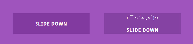
<button class="btn btn-5 btn-5a icon-cart"><span>Add to cart</span></button>■修正後
<button class="btn btn-3 btn-3a" id="btn_3a">
	<span class="face">lll<br>c⌒っ´ʘ‿ʘ`)っ</span>
	<span class="text">SLIDE DOWN</span>
</button>文言とアイコンはspanで分けてみました。
アイコン部分は顔文字にております( ˘ω˘)☝
css
■参考元
/* Button 5 */
.btn-5 {
	background: #823aa0;
	color: #fff;
	height: 70px;
	min-width: 260px;
	line-height: 24px;
	font-size: 16px;
	overflow: hidden;
	-webkit-backface-visibility: hidden;
	-moz-backface-visibility: hidden;
	backface-visibility: hidden;
}

.btn-5:active {
	background: #9053a9;
	top: 2px;
}

.btn-5 span {
	display: inline-block;
	width: 100%;
	height: 100%;
	-webkit-transition: all 0.3s;
	-webkit-backface-visibility: hidden;
	-moz-transition: all 0.3s;
	-moz-backface-visibility: hidden;
	transition: all 0.3s;
	backface-visibility: hidden;
}

.btn-5:before {
	position: absolute;
	height: 100%;
	width: 100%;
	line-height: 2.5;
	font-size: 180%;
	-webkit-transition: all 0.3s;
	-moz-transition: all 0.3s;
	transition: all 0.3s;
}

.btn-5:active:before {
	color: #703b87;
}

/* Button 5a */
.btn-5a:hover span {
	-webkit-transform: translateY(300%);
	-moz-transform: translateY(300%);
	-ms-transform: translateY(300%);
	transform: translateY(300%);
}

.btn-5a:before {
	left: 0;
	top: -100%;
}

.btn-5a:hover:before {
	top: 0;
}
■修正後
/* Button 3 */
.btn-3 {
  background: #823aa0;
  color: #fff;
  height: 70px;
  min-width: 260px;
  line-height: 24px;
  font-size: 16px;
  overflow: hidden;
}
.btn-3 .text {
  display: inline-block;
  width: 100%;
  height: 100%;
  position: absolute;
}
.btn-3 .face {
  position: absolute;
  height: 100%;
  width: 100%;
  line-height: 2;
  font-size: 100%;
  position: absolute;
}

/* Button 3a */
.btn-3a span {
  left: 0px;
}
.btn-3a .text {
  top: 25px;
}
.btn-3a .face {
  top: -100%;
}
js
<script>
$(function() {
	var SPEED = 300;/* スピード設定 */
	$(".btn-3a").enter(function() {
		$(this).stop().animate(/* マウスを乗せたとき */
			{ "backgroundColor" : "#9053a9" }, SPEED);
		$(this).find(".text").stop().animate(
			{ "top" : "80px" }, SPEED);
		$(this).find(".face").stop().animate(
			{ "top" : "0px" }, SPEED);
	},function() {
		$(this).stop().animate(/* マウスが外れたとき */
			{ "backgroundColor" : "#823AA0" }, SPEED);
		$(this).find(".text").stop().animate(/* マウスが外れたとき */
			{ "top" : "25px" }, SPEED);
		$(this).find(".face").stop().animate(
			{ "top" : "-100%" }, SPEED);
	});
});
</sctipt>
こちらは全体の背景のアニメーションとそれぞれの要素が違う動きをするので上記を同様に個別にアニメーションをつけます( ˘ω˘)☝
アニメーションの動きも設定してみよう
アニメーションの動きもプラグインで変えてしまいましょう
( ˘ω˘)☞ jQuery Easing Plugin
動きの種類は現在33種類あります。
( ˘ω˘)☞jQuery Easing Plugin エフェクト一覧ページ
使い方は簡単です!プラグインをDLしてeasing名を指定してあげるだけで段々速くなる動きやバウンドしてるような動きを実装することができます( ˘ω˘)
$(this).stop().animate(
               { "backgroundColor" : "#ffffff" }, SPEED, "easing名");
     }
まとめ
いかがでしたかでしょうか。
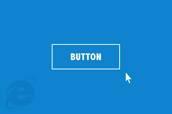
CSS3でも実装可能になったアニメーションですが、IE9からは上手く効かずにカクカクになってしまいます( ∵ )
jQueryで実装すればIEでの再現は可能ですので、併用してIEブラウザだけjsを振り分ければばっちりですね!
今回は動きを模写しただけですのでjsのソースをそのまま参照をしたサイトのHTMLを読み込んでも対応ができませんのでご了承ください( ˘ω˘)☝
LIGはWebサイト制作を支援しています。ご興味のある方は事業ぺージをぜひご覧ください。