どうもですよ! はやちですよ٩( ᐛ )و
みなさまシルバーウィークいかがお過ごしでしたか( ˇωˇ )
私は編集部のみなさんと行った東京ゲームショウのビジネスデーの他に、一般の土日にも参加してしまいました( ˇωˇ)
やはり一般の参加人数はかなり多かったです……でも楽しかっタァ٩( ᐛ )و
そんなことはどうでもいいですね٩( ᐛ )و
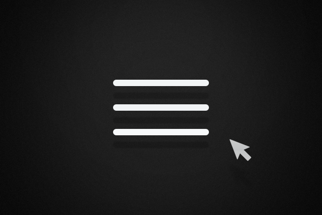
今回は以前に「スマホに特化したアコーディオンメニューを作ってみた」でほんの少しご紹介した、ハンバーガーアイコンのアニメーションをもう少し掘り下げてバリエーションを増やしてみました!
ご紹介します( ˇωˇ)☝
▼はやちのアニメーション CSS3のanimation(アニメーション)で春うららかな桜を降らせてみた 非公開: CSS3とjQueryでオリジナル画像のスプライトアニメーションを実装する方法 非公開: jQueryでページトップへ戻るボタンに動きをつけよう
 はやち
はやち
 はやち
はやち
 はやち
はやち
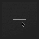
ハンバーガアイコンアニメーションの実装
HTMLは今回spanを3つで構成しました。
これで色々ご紹介していこうと思います( ˇωˇ)☝
<div class="icon-animation type-1">
    <span class="top"></span>
    <span class="middle"></span>
    <span class="bottom"></span>
</div>
お次にアニメーションの実装をご紹介します。
CSSは全てSassの構造で書いております( ˇωˇ )
1. よくみかける動き
動き出す前の傾きとバーの位置をtransformで調整をします。
こちら、以前ご紹介した「スマホに特化したアコーディオンメニューを作ってみた」のアイコンも同じような実装をしております( ˇωˇ)☝
押す前
.type-1 {
  span {
    transition: all 0.3s;
    transform: rotate(0deg);
  }
  .top {
    transform: translateY(-17px);
  }
  .bottom {
    transform: translateY(17px);
  }
}
押した後
.type-1.is-open {
  .middle {
    background: rgba(255, 255, 255, 0);
  }
  .top {
    transform: rotate(-45deg) translateY(0px);
  }
  .bottom {
    transform: rotate(45deg) translateY(0px);
  }
}
2. ホバーでも動かしてみる
上記の実装と併せてhoverしたとき、若干バーの位置を動かしてあげるのも押せる感があって良いかもしれませんね( ˇωˇ)☝
押す前
.type-2 {
  span {
    transition: all 0.3s;
    transform: rotate(0deg);
  }
  .top {
    transform: translateY(-17px);
  }
  .bottom {
    transform: translateY(17px);
  }
}
hover
.type-2:hover {
  .top {
    transform: translateY(-20px);
  }
  .bottom {
    transform: translateY(20px);
  }
}
押した後の動き
.type-2.is-open {
  .middle {
    background: rgba(255, 255, 255, 0);
  }
  .top {
    transform: rotate(-45deg) translateY(0px);
  }
  .bottom {
    transform: rotate(45deg) translateY(0px);
  }
}
3. 真ん中の棒がピューっと飛んでいく
先ほどでは真ん中のバーを背景色で消していましたが、真ん中のバーをtransformで位置を動かして要素を消します。
押す前
.type-3 {
  span {
    transition: all 0.3s;
  }
  .middle {
    transform: translateX(0px);
  }
  .top {
    transform: translateY(-17px);
  }
  .bottom {
    transform: translateY(17px);
  }
}
押した後の動き
.type-3.is-open {
  .middle {
    transform: translateX(100px);
    background: rgba(255, 255, 255, 0);
  }
  .top {
    transform: rotate(-45deg) translateY(0px);
  }
  .bottom {
    transform: rotate(45deg) translateY(0px);
  }
}
4. 上下の線がくるくる回る
押す前
.type-4 {
  span {
    transition: all 0.5s;
    transform: translateY(0px) !important;
  }
  .top {
    margin-top: -17px;
    transform: rotate(0deg) !important;
  }
  .bottom {
    margin-top: 17px;
    transform: rotate(0deg) !important;
  }
}
押した後の動き
真ん中のバーを消しつつ、上下のバーを45°で指定してたのを9回分の405°にして、ぐるぐる回る見せ方にしてます( ˇωˇ)☝
.type-4.is-open {
  .middle {
    background: rgba(255, 255, 255, 0);
  }
  .top {
    transform: rotate(-405deg) !important;
    margin-top: 0px;
  }
  .bottom {
    transform: rotate(405deg) !important;
    margin-top: 0px;
  }
}
5. 線が消えつつ、くるっと変わる
押す前
.topと.bottomは消す用の線、バツにする線は真ん中の擬似要素で用意して位置を0に設定します。
.type-5 {
  .inner {
    width: 50px;
    height: 50px;
    margin: auto;
    position: relative;
    padding: 75px 0;
  }
  span {
    transition: width 0.2s, right 0.2s, left 0.2s;
  }
  .top {
    transform: translateY(-17px);
    left: 0px;
    right: 0px;
  }
  .middle {
    transform: translateY(0px);
    position: relative;
    background: none;
    &:before, &:after {
      content: "";
      transition: all 0.2s;
      display: block;
      position: absolute;
      width: 50px;
      height: 1px;
      left: -25px;
      background: #fff;
      transform: rotate(0deg);
    }
  }
  .bottom {
    transform: translateY(17px);
    left: 0px;
    right: 0px;
  }
}
押した後の動き
押したら上下がwidth:0で消えて、真ん中の線の擬似要素が動き、バッテンに変わります( ˇωˇ)☝
.type-5.is-open {
    .top {
      left: 100%;
      width: 0px;
    }
    .middle {
      &:before {
        transform: rotate(135deg);
      }
      &:after {
        transform: rotate(45deg);
      }
    }
    .bottom {
      right: 100%;
      width: 0px;
    }
  }
6. 上下の線が真ん中に寄る
上下のバーが消えた後にバッテンを表示させたいので、transitionでは完結できません。animationを使用して設定をします( ˇωˇ)☝
押す前
.type-6 {
  span {
    position: relative;
    transition: 0.3s opacity;
  }
  .top {
    animation: type6-top .5s;
    animation-fill-mode: forwards;
  }
  .middle {
    transition: .5s opacity;
    transform: translateY(-1px);
    opacity: 1;
  }
  .bottom {
    animation: type6-bottom .5s;
    animation-fill-mode: forwards;
  }
}
押した後の動き
.type-6.is-open {
  .middle {
    opacity: 0;
    transition: .5s opacity;
  }
  .top {
    animation: type6-top-close .5s;
    animation-fill-mode: forwards;
  }
  .bottom {
    animation: type6-bottom-close .5s;
    animation-fill-mode: forwards;
  }
}
アニメーションの設定
アニメーションは押してバッテンになるときの動きと、戻るときの動きを用意します。両方ないと戻るときの動きがないので、いきなりパッと戻ってしまいますのでお気をつけを( ˇωˇ)☝
@keyframes type6-top {
  0% {
    transform: translateY(0px) rotate(-45deg);
  }
  50% {
    transform: translateY(0px) rotate(0deg);
  }
  100% {
    transform: translateY(-17px) rotate(0deg);
  }
}

@keyframes type6-bottom {
  0% {
    transform: translateY(-1px) rotate(45deg);
  }
  50% {
    transform: translateY(0px) rotate(0deg);
  }
  100% {
    transform: translateY(15px) rotate(0deg);
  }
}

@keyframes type6-top-close {
  0% {
    transform: translateY(-17px) rotate(0deg);
  }
  50% {
    transform: translateY(0px) rotate(0deg);
  }
  100% {
    transform: translateY(0px) rotate(-45deg);
  }
}

@keyframes type6-bottom-close {
  0% {
    transform: translateY(15px) rotate(0deg);
  }
  50% {
    transform: translateY(0px) rotate(0deg);
  }
  100% {
    transform: translateY(-1px) rotate(45deg);
  }
}
7. 上下の線が真ん中に小さくなりつつ寄る
押す前
動きもいっぺんに動くので、transitionで設定できます( ˇωˇ)☝
.type-7 {
  span {
    transition: all 0.3s;
  }
  .top {
    transform: translateY(-17px) scale(1);
  }
  .middle {
    background: none;
    position: relative;
    &:before, &:after {
      transition: all 0.3s;
      content: "";
      width: 50px;
      height: 1px;
      background: #fff;
      display: block;
      transform: rotate(0deg);
      position: absolute;
    }
  }
  .bottom {
    transform: translateY(17px) scale(1);
  }
}
押した後の動き
上の動きと似ていますが上下のバーがだんだん小さくなりつつ集まっていきます。
.type-7.is-open {
  .top {
    transform: translateY(0px) scale(0);
  }
  .bottom {
    transform: translateY(0px) scale(0);
  }
  .middle {
    &:before {
      transform: rotate(45deg);
    }
    &:after {
      transform: rotate(-45deg);
    }
  }
}
8. 真ん中の線が分割する
全てのバーを擬似要素で設定して上下は折り曲げられるように、真ん中は分割ができるように設定をします( ˇωˇ)☝
押す前
.type-8 {
  span {
    position: relative;
    background: none;
    transition: all 0.3s;
    &:before, &:after {
      transition: all 0.3s;
      content: "";
      width: 25px;
      height: 1px;
      display: block;
      background: #fff;
      position: absolute;
    }
    &:before {
      transform: translateX(0px);
      opacity: 1;
    }
    &:after {
      transform: translateX(25px);
      opacity: 1;
    }
  }
  .top {
    transform: translateY(-17px);
  }
  .middle {
    transform: translateY(0px);
  }
  .bottom {
    transform: translateY(17px);
  }
}
押した後の動き
真ん中のバーは真っ二つに!
上下のバーはrotateで折り曲げてバッテンにします( ˇωˇ)☝
.type-8.is-open{
  .middle {
    &:before {
      transform: translateX(-100px);
      opacity: 0;
    }
    &:after {
      transform: translateX(100px);
      opacity: 0;
    }
  }
  .top {
    transform: translateY(-10px);
    &:before {
      transform: translateX(8px) rotate(45deg);
    }
    &:after {
      transform: translateX(25px) rotate(-45deg);
    }
  }
  .bottom {
    transform: translateY(5px);
    &:before {
      transform: translateX(8px) rotate(-45deg);
    }
    &:after {
      transform: translateX(25px) rotate(45deg);
    }
  }
}
9. 波紋が広がる
押す前
バーの動きははじめの方と実装は同じですが、波紋は真ん中のバーの擬似要素を使用して設定します( ˇωˇ)☝
.type-9 {
  span {
    transition: all 0.4s 0.4s;
    &:before, &:after {
      content: "";
    }
  }
  .top {
    transform: translateY(-17px);
  }
  .middle {
    position: relative;
    background: none;
    &:after{
      content: "";
      display: block;
      width: 100px;
      height: 100px;
      border-radius: 100%;
      left: 50%;
      top: 50%;
      margin-left: -50px;
      margin-top: -50px;
      position: absolute;
    }
    &:before{
      content: "";
      transition: all 0.4s;
      width: 50px;
      display: block;
      height: 1px;
      background: #fff;
      transform: translateY(0px) translateX(0px);
      opacity: 1;
    }
  }
  .bottom {
    transform: translateY(17px);
  }
}
押した後の動き
.type-9.is-open {
  .bottom {
    transform: translateY(0px) rotate(45deg);
  }
  .top {
    transform: translateY(0px) rotate(-45deg);
  }
  .middle {
    &:before{
      transform: translateY(0px) translateX(100px);
      opacity: 0;
    }
    &:after{
      content: "";
      animation: type9-circle .5s;
      animation-fill-mode: forwards;
    }
  }
}
波紋のアニメーション
波紋のアニメーションは後から出てくるのでanimationで設定をします( ˇωˇ)☝
@keyframes type9-circle{
  0%{
    transform:scale(0);
    opacity: 1;
    border: 1px solid #fff;
  }
  100%{
    opacity: 0;
    border: 1px solid #fff;
    transform:scale(1.5);
  }
}
まとめ
いかがでしたでしょうか?
以前から、ハンバーガーアニメーションのいろんな動きを取りまとめておきたいなと思っておりました! コピペするだけでなく、どの箇所がどのように動いているかちゃんと理解することが大事ですね( ˇωˇ)
まとまったものは、こちらになります( ˘ω˘)☞三☞シュッシュッDEMO
ではでは。
LIGはWebサイト制作を支援しています。ご興味のある方は事業ぺージをぜひご覧ください。